Pregunta a l'IA
Hola! Pregunta'm qualsevol cosa
Content

Elephant provides a DefaultElement with edition capabilities. The editor uses its own wiki syntax, EWiki syntax for web pages with heavy formatting, and Wiki syntax for e-mails or slightly formatted pages.

The elements at play

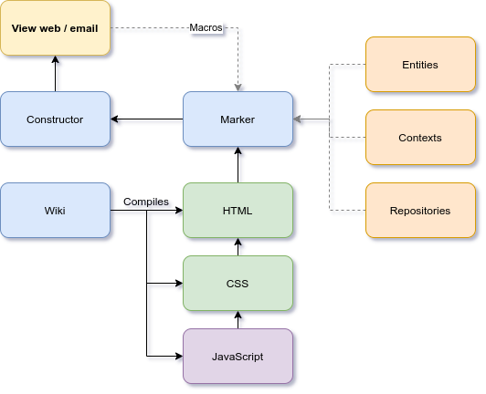
This graphic shows the elements that provide content for a web page or an email. By changing the templates root, the marker will generate different layouts. The wiki syntax ensures that the content fits into these templates.

What will we see in here?

Syntax and layouts
These tutorials require a little understanding of EWiki syntax . Some layouts will be recommended, for example in landing pages, see Context .

Tutorials

These are short tutorials, but require some quality time. They all cover some important parts of the EWiki syntax, including Wmacros. You may use traversal reading, when trying to remember something, but have in mind that, if you plan to create rich layouts, you will need to fully read them.

Writing content to be emailed

When writing content for emails, complex macros and some multimedia won't render correctly in email clients.

Email content restrictions:

Email applications
Most of the email clients, protect themselves from malicious code and formatting that could endanger their layouts. You may format your content, and add images, but you shouldn't use framework capabilities, since the framework won't run on these apps.

This table shows the content that could be sent as an email:

Location Description
Publications' summary Publications have two content parts, the summary and the body. If the publication is intended to be sent by email, use email restrictions in the summary. The body can be reached from the email from the Read more... button.
Noticeboard / Marketplace Use email restrictions in the content.
Convocations Use email restrictions in the content. Notice that the content will be attached to the calendar, in a more restricted environment.
Publication support
For convocations referring to events, the best approach is to use a publication as the announcement, with a link to the convocation. If the user is not registered, the convocation will show the option to register.

Easy write
// Wiki
---++Let's start writing
**Wiki** and **EWiki** make easy writing HTML pages. Both are similar, both part of the **Elephant** libraries, being the main difference where this HTML will be used for. **Wiki** will generate e-mail compatible HTML/CSS, while **EWiki** helps to create rich compositions. 

Let's start writing

Wiki and EWiki make easy writing HTML pages. Both are similar, both part of the Elephant libraries, being the main difference where this HTML will be used for. Wiki will generate e-mail compatible HTML/CSS, while EWiki helps to create rich compositions.
// Wiki
@w{stripe(color=secondary)}
Using stripes, you can easily draw the attention to separated content.
@w{/stripe} 
Using stripes, you can easily draw the attention to separated content.
// Wiki
@w{message(icon=info,class=info,header=Messages)}
Or use messages to inform.
@w{/message}
Messages
Or use messages to inform.
// Wiki
@w{note(class=info,header=Notes)}
Or notes.
@w{/note}
Notes
Or notes.
// Wiki
Or use icons %icon-home% and emojis %emoji-smiley%

Or use icons and emojis

// Wiki
@w{segment(class=big)}
And make both big %icon-home% %emoji-smiley%
@w{/segment}
@w{segment(class=huge)}
Or huge %icon-home% %emoji-smiley%
@w{/segment}
@w{segment(class=massive)}
Or massive %icon-home% %emoji-smiley%
@w{/segment}
And make both big
Or huge
Or massive
// Wiki
Or use lists
 * Item 1
 * Item 2
  * Item 2.1
 * Item 3 

Or use lists

  • Item 1
  • Item 2
    • Item 2.1
  • Item 3
// Wiki
Maybe numbered lists
 1 Item 1
 1 Item 2
 1 Item 3 

Maybe numbered lists

  1. Item 1
  2. Item 2
  3. Item 3
// Wiki
Write text with different typefaces, like **bold**, ==monospaced==, __italic__, it's also easy.

Write text with different typefaces, like bold, monospaced, italic, it's also easy.

// Wiki
---+Headers can also help
---++With different sizes
---+++And automatic margins

Headers can also help

With different sizes

And automatic margins

Navigate next sections to know more...

Landing pages

Landing pages can exist in any context/branch, including the initial web page. There is more to a context, but we'll be focusing on the specifics for a landing.

The page's left and right margin

By default, the template used in most websites would be Layout=default-web. Setting this property for the ROOT context, will propagate for all pages.

Any context can override this by setting Local layout=default-landing, for example. Local layout will be used in that context, and will not propagate in its own branch. Let's see a common configuration for the ROOT context:

// All pages will use the default web layout
Layout = default-web
// This page, instead, will use the default landing layout
Local layout = default-landing

For this current context we used:

// Only here we will use the default landing layout, will not propagate
Local layout = default-landing

Notice that the stripe color covers the whole space, from left to right.

This content is within a padded text stripe, to provide space
The header adds an icon, changing the color and adding some animation.

The components

The text stripe adds more left and right margins, and increases a bit the font size. In general, when writing text in left to right containers, it's better to use text stripes. Exceptions would be when using columns.

In this text stripe we use a transparent background image, one of the stock images. You can also use your own images for backgrounds, and add content on top. By default, stripes create a color background, and a font color with enough contrast. You can change font color by using innerColor property.

The wiki we used

// ${parser.imgtbg('/glow-1.png')} stands for a stock image. You can use your own images URL.
@w{textstripe(class=very padded,color=Deep-SeaBlue,image=${parser.imgtbg('/glow-1.png')})}
@w{header(class=inverted big,icon=huge yellow loading cog)}
This content is within a padded text stripe, to provide space
@w{subheader}
The header adds an icon, changing the color and adding some animation.
@w{/subheader}
@w{/header}

---+++The components

The text stripe adds more left and right margins, and increases...
@w{/textstripe}
Use your own image as a background
And create complicated layouts

Describing your product/service features, how to buy and next actions.

Some action

Who you are, how to contact, why everyone should trust your company.

Contact

Community, projects, forums. The activity you're generating in every day tasks.

Community

The wiki we used

@w{stripe(class=very padded,image=repository(/bg-example.png))}

@w{header(class=big)}
Use your own image as a background
@w{subheader}
And create complicated layouts
@w{/subheader}
@w{/header}

@w{grid(class=three column padded stackable)}

@w{column}

%icon-huge cubes%

Describing your product/service features, how to buy and next actions.

@w{button(class=primary,icon=right caret,link=#,text=Some action)}
@w{/column}

@w{column(class=center aligned)}

%icon-huge university%

Who you are, how to contact, why everyone should trust your company.

@w{button(class=primary,link=#,text=Contact)}
@w{/column}

@w{column(class=right aligned)}

%icon-huge orange comments%

Community, projects, forums. The activity you're generating in every day tasks.

@w{button(class=basic secondary,icon=right caret,link=#,text=Community)}
@w{/column}

@w{/grid}

@w{/stripe}
Breaking conventional margins
Reaching the entire screen width. Notice that the layout still adapts to small devices' screen.

Describing your product/service features, how to buy and next actions.

Some action

Who you are, how to contact, why everyone should trust your company.

Contact

Community, projects, forums. The activity you're generating in every day tasks.

Community

The wiki we used

The only change is the first container, widestripe instead of stripe. This container adds no margins, which requires padding or padded content.
@w{widestripe(class=very padded,image=repository(/bg-example.png))}

@w{header(class=big center aligned)}
Breaking conventional margins
@w{subheader}
Reaching the entire screen width. Notice that the layout still adapts to small devices' screen.
@w{/subheader}
@w{/header}

@w{grid(class=three column padded stackable)}

@w{column}

%icon-huge cubes%

Describing your product/service features, how to buy and next actions.

@w{button(class=primary,icon=right caret,link=#,text=Some action)}
@w{/column}

@w{column(class=center aligned)}

%icon-huge university%

Who you are, how to contact, why everyone should trust your company.

@w{button(class=primary,link=#,text=Contact)}
@w{/column}

@w{column(class=right aligned)}

%icon-huge orange comments%

Community, projects, forums. The activity you're generating in every day tasks.

@w{button(class=basic secondary,icon=right caret,link=#,text=Community)}
@w{/column}

@w{/grid}

@w{/widestripe}
Using stripes
Stripes allow creating content within a container that can change padding, background color, font color, and it's sensible to its position. Stripes are mainly used on landing pages, to draw attention to specific sections.
@w{stripe(color=c2)}
Stripes allow creating content within a container that can change...
@w{/stripe}
Text stripes enhance the text reading, by giving more padding and a slightly bigger font. A common use is to provide a brief explanation, and then switch to a normal stripe with a longer description, or provide links to more elaborated content.
@w{textstripe(color=primary)}
Text stripes enhance the text reading, by giving more padding and...
@w{/textstripe}
Stripes can have background images, change their size and add padding.
// class=very padded, adds extra padding to the external container. Can also be padded, removing very.
// innerClass=massive, gives extra size to the inner container. Can also be tiny, small, medium, big, huge.
// innerColor=brown, forces the inner container font color.
@w{stripe(class=very padded,innerClass=massive,innerColor=brown,image=repository(/bg-example.png))}
Stripes can have background images, change their size and add padding.
@w{/stripe}
Best practices when using stripes
  • If using stripes from examples, don't use unnecessary properties. When not using a property, remove it.
  • If you started a page content with a stripe, continue doing so. Stripes add their own margins and paddings, and leave no spaces between each other. The whole page will have a sound appearance, and you'll be able to experiment in each stripe.
  • Don't use stripes on text related pages. Wiki has enough elements to help you to create content, adding images, videos, buttons, tables...
  • Stripes work better on full width or standard pages, when not sharing space with lateral menus. If you want to add information points, warnings and so, use Messages like this one.
Using headers

Elephant's wiki accepts different notations to create headers. The easy one, perfect for text based pages, uses ---+, and the header level is controlled by the number of plus signs. For example:

Header level 2

Lorem ipsum dolor sit amet, consectetur adipiscing elit...
---++Header level 2
Lorem ipsum dolor sit amet, consectetur adipiscing elit...

Margins are automatically set, and ensure a consistent flow of text.

Using Wmacros

Wmacros allow headers in complicated scenarios, like extensive use of size, icons, images, sub headers, and other variations. Margins work the same way as in easy headers, you can use them indistinctively.

Large header
@w{header(class=large)}Large header@w{/header}
Icon header
@w{header(class=large,icon=cog)}Icon header@w{/header}
Huge icon header
@w{header(class=huge,icon=cog)}Huge icon header@w{/header}
Header and sub header
This is a sub header
@w{header(class=large)}
Header and sub header
@w{subheader}This is a sub header@w{/subheader}
@w{/header}

Centered header
with a centered sub header
@w{header(class=red center aligned large)}
%icon-orange huge cog%
Centered header
@w{subheader}with a centered sub header@w{/subheader}
@w{/header}

In the examples, we made use of sizes and colors. Tutorials include a description and examples of both.

Using tables

Elephant Wiki and EWiki offer different ways of creating tables. While Wiki is addressed for more simple content, or e-mails, the EWiki syntax is largely recommended.

The Table Wmacros accept a variety of structures, going from auto-creating columns to full column detail, for table headers, value rows, and footers.

Col 1 Col 2 Col 3
Value 1 Value 2 Value 3
Total 1 Total 2 Total 3
@w{table}
@w{theader(values="Col 1|Col 2|Col 3")}
@w{trow(values="Value 1|Value 2|Value 3")}
@w{tfooter(values="Total 1|Total 2|Total 3")}
@w{/table}

This example shows how to auto-create columns. Cell values are separated by the | character.

By default a table will use the full width of the container. You can change this by declaring a collapsing table.

Col 1 Col 2 Col 3
Value 1 Value 2 Value 3
@w{table(class=collapsing)}
@w{theader(values="Col 1|Col 2|Col 3")}
@w{trow(values="Value 1|Value 2|Value 3")}
@w{/table}

You can also create definition tables.

Table Description Included
Concept 1 Describing concept 1
Concept 2 Describing concept 2
@w{table(class=definition)}
@w{theader(values="Table|Description|Included")}
@w{trow(values="Concept 1|Describing concept 1|%icon-green checkmark%")}
@w{trow(values="Concept 2|Describing concept 2|%icon-red times%")}
@w{/table}

Long tables can be striped.

Col 1 Col 2 Col 3
Value 1 Value 2 Value 3
@w{table(class=striped)}
@w{theader(values="Col 1|Col 2|Col 3")}
@w{trow(values="Value 1|Value 2|Value 3")}
@w{/table}

For highly formatted tables, cells can be detailed using columns.

Name Status Notes
John
  • Great feedback
  • Found the new features
Visit
Donald Doesn't seem to understand Not interesting
@w{table(class=celled)}
@w{theader(values="Name|Status|Notes")}
@w{trow}
@w{tcol(value=John)}
@w{tcol(class=positive)}
 * Great feedback
 * Found the new features
@w{/tcol}
@w{tcol(value=Visit)}
@w{/trow}
@w{trow}
@w{tcol(value=Donald)}
@w{tcol(class=negative,value="Doesn't seem to understand")}
@w{tcol(class=warning,value=Not interesting)}
@w{/trow}
@w{/table}

Notice that trow without the values parameter requires specifying tcol separately, and have a closing trow. Same case for tcol without the value parameter. Whenever a column has any kind of formatted content, including an inner table, you'll use the open/closing tcol Wmacro.

Using images

First thing you need to know, the image file must exist in a public location, within your website or in a public URL. Elephant provides public repositories for each context and entity. When using the Wiki editor, the easiest way to access the image repository is to click on the image icon in the toolbar.

Elephant Wiki and EWiki offer different ways of inserting images. The standard way uses the img tag:

The image will use the entire width of the container.
[img URL]

Using Wmacros

Images can be centered. In this case, the text will also be centered and will use a smaller font.
@w{centeredImage}
[img URL]
Description of the image.
@w{/centeredImage}
Images can specify size (mini, tiny, small, medium, large, big, huge, massive). For images taking full width, see below.
@w{image(class=tiny,src="repository(/Elephant-Logo.png)")}
@w{image(class=small,src="repository(/Elephant-Logo.png)")}
And or modifiers.
@w{image(class=small circular,src="repository(/Elephant-Logo.png)")}
The alignment.
@w{image(class=small circular centered,src="repository(/Elephant-Logo.png)")}
And the vertical alignment (top, middle, bottom).
@w{image(class=small middle aligned,src="repository(/Elephant-Logo.png)")} With this text.
With this text.
Images can have additional spacing, when included within other content.
The Elephant library @w{image(class=mini spaced,src="repository(/Elephant-Logo.png)")} rocks!

The Elephant library rocks!

Any image can be used as an avatar.
@w{image(class=avatar,src="repository(/Elephant-Logo.png)")}
A fluid image, takes up the width of its container.
@w{image(class=fluid,src="repository(/Elephant-Logo.png)")}
Using containers

Previous tutorials have shown stripes, which you might say, are containers. This tutorial aims to show other containers, who's main use is to provide margins, paddings along with stripe-like colors and framework colors. Following tutorials explain in more detail how colors work.

Segments

Segments and solids are containers with its own margins. They provide an easy way to add content and show it is related. We have used segments when providing examples, and we'll continue to do so.

This text is enclosed in a segment.
@w{segment}
This text is enclosed in a segment.
@w{/segment}
Segments can be basic, respecting the same margins, but without border.
@w{segment(class=basic)}
Segments can be **basic**, respecting the same margins, but without border.
@w{/segment}
Segments can have framework colors...
@w{segment(class=blue)}
Segments can have framework colors...
@w{/segment}
...and use them as background.
@w{segment(class=inverted blue)}
...and use them as background.
@w{/segment}

Solids

Solids are basically segments tuned to allow systems colors.

This text is enclosed in a solid.
@w{solid(color=c2)}
This text is enclosed in a solid.
@w{/solid}

Solids use a different way to decide the font color, but the result is similar.

This text is enclosed in a solid.
@w{solid(color=primary)}
This text is enclosed in a solid.
@w{/solid}
Solids can also use background images.
@w{solid(image=repository(/bg-example.png))}
Solids can also use background images.
@w{/solid}

Transparent

By default, segments and solids have a background. transparent is an easy way to use segments that use their container background.

This text is enclosed in a segment.
@w{transparent}
This text is enclosed in a segment.
@w{/transparent}
Using grids

We used grids when talking about landing pages. Grids are a powerful tool when dealing with content columns. Yes, there is a similarity between tables and grids, but let's think of grids as a composition tool, whilst tables are showing data tools.

The default grid creates 16 columns. When adding columns, you can specify how many grid columns you want to use for a single column. In the example, one column takes 4, the other 12, 4 + 12 = 16. We added stackable to make the grid responsive, that is, on small screen devices, the columns will stack, taking each full width.
Community
Join our community and subscribe to the mail lists, announcements and access our projects.
Join
@w{grid(class=stackable)}
@w{column(class=four wide)}
%icon-purple massive users%
@w{/column}
@w{column(class=twelve wide middle aligned)}
@w{header}
Community
@w{subheader}
Join our community and subscribe to the mail lists, announcements and access our projects.
@w{/subheader}
@w{/header}
@w{button(class=primary,link=#,text=Join)}
@w{/column}
@w{/grid}
When adding columns, if the total row's size is fulfilled, the grid will automatically add the columns in a new row. The example uses a height column grid.
1
2
3
4
5
6
7
8
9
10
11
12
13
14
15
16
@w{grid(class=height column center aligned)}
@w{column}1@w{/column}
@w{column}2@w{/column}
@w{column}3@w{/column}
@w{column}4@w{/column}
@w{column}5@w{/column}
@w{column}6@w{/column}
@w{column}7@w{/column}
@w{column}8@w{/column}
@w{column}9@w{/column}
@w{column}10@w{/column}
@w{column}11@w{/column}
@w{column}12@w{/column}
@w{column}13@w{/column}
@w{column}14@w{/column}
@w{column}15@w{/column}
@w{column}16@w{/column}
@w{/grid}
You can also force new rows, handy when creating a centered grid. In the example, we create a grid with 3 columns. But we'll not use them, instead, we'll force new rows.
@w{grid(class=three column centered)}
@w{row}
@w{column}%icon-blue massive users%@w{/column}
@w{/row}
@w{row}
@w{column}%icon-blue massive users%@w{/column}
@w{/row}
@w{/grid}
Columns can use their own alignment, horizontally (left/center/right aligned) and vertically (top/middle/bottom aligned). Notice that grids can also be celled, showing its borders.
Aligned to the left.
Center aligned.
Aligned to the right.
@w{grid(class=three column celled)}
@w{column(class=left aligned)}
Aligned to the left.
@w{/column}
@w{column(class=center aligned)}
Center aligned.
@w{/column}
@w{column(class=right aligned)}
Aligned to the right.
@w{/column}
@w{/grid}
Cells can also use framework colors. If you prefer system colors, have in mind that grids' cells are transparent, if inside a stripe with a background color, that would be the cell's background color. Same if the stripe uses an image as background. If you want an individual cell, use a stripe inside.
Yellow
Olive
Black
@w{grid(class=three column center aligned)}
@w{column(class=yellow)}Yellow@w{/column}
@w{column(class=olive)}Olive@w{/column}
@w{column(class=black)}Black@w{/column}
@w{/grid}
Alignment
We used grid alignment in very different ways. You should be aware about the meaning of these alignments, because they became more important when the columns contain backgrounds. The table contains the complete set.
class Description Scope
centered Centers horizontally the column itself table
left/center/right aligned Horizontally aligns the column content table for all columns, trow for columns in a row, tcol for a specific column
top/middle/bottom aligned Vertically aligns the column content table for all columns, trow for columns in a row, tcol for a specific column
Using notes

Notes are specialized segment to emphasize some content.

Standard note.
@w{note}
Standard note.
@w{/note}
With a header
Headers are slightly bigger and bold.
@w{note(header=With a header)}
Headers are slightly bigger and bold.
@w{/note}
Information
Notes can be informative.
@w{note(class=info,header=Information)}
Notes can be informative.
@w{/note}
Warning
Warn about something.
@w{note(class=warning,header=Warning)}
Warn about something.
@w{/note}
Error
Inform about an error.
@w{note(class=error,header=Error)}
Inform about an error.
@w{/note}
Positive
Positive messages.
@w{note(class=positive,header=Positive)}
Positive messages.
@w{/note}
Negative
Negative messages.
@w{note(class=negative,header=Negative)}
Negative messages.
@w{/note}
Idea
Ideas.
@w{note(class=idea,header=Idea)}
Ideas.
@w{/note}
Technical
Technical messages.
@w{note(class=tech,header=Technical)}
Technical messages.
@w{/note}
View
View information.
@w{note(class=view,header=View)}
View information.
@w{/note}
@w{note(class=like,header=Like)}
Likes.
@w{/note}
Colored backgrounds
When using colored containers, notes will create a slightly darker background.
@w{note(class=info,header=Colored backgrounds)}
When using colored containers, notes will create a slightly darker background.
@w{/note}
Image backgrounds
When using image backgrounds, notes will create a slightly darker part of the image.
@w{note(class=info,header=Image backgrounds)}
When using image backgrounds, notes will create a slightly darker part of the image.
@w{/note}
Dark backgrounds
When the container's background is dark, you can specify inverted in class, and turn colors to white.
@w{note(class=inverted info,header=Dark backgrounds)}
When the container's background is dark, you can specify **inverted** in **class**, and turn colors to white.
@w{/note}
Using accordions

Accordions are usually seen in FAQs (Frequently Asked Questions), where the goal is to find the question, and then unfold the answer.

Some simple FAQs about accordions.
How to keep only one answer open?
This is the default behaviour for accordions. If you want to keep the content open, use the class free.
Can accordions be styled?
Yes, add the class styled to add borders and make the title bold. If you want to enhance only the title, then use basic styled. You may also want to add the class fluid, so the accordion takes the whole width available.
How to make the title font bigger?
Add the class bigger to the title.
How to add more format to content?
You're free to create any content inside an asection, including heavy formating. In case you wanted to have full control over title and content, you could use atitle and acontent Wmacros.
@w{asection(title="Title")}
Content
@w{/asection}

Is equivalent to:

@w{atitle}
Title
@w{/atitle}
@w{acontent}
Content
@w{/acontent}

And both atitle and acontent accept class and style.

@w{accordion(class=basic styled fluid)}

@w{asection(title="How to keep only one answer open?")}
This is the default behaviour for accordions. If you want to keep the content open, use the **class** ==free==.
@w{/asection}

@w{asection(title="Can accordions be styled?")}
Yes, add the **class** ==styled== to add borders and make the title bold. If you want to enhance only the title, then use ==basic styled==. You may also want to add the **class** ==fluid==, so the accordion takes the whole width available.
@w{/asection}

@w{asection(title="How to make the title font bigger?")}
Add the **class** ==bigger== to the title.
@w{/asection}

@w{asection(title="How to add more format to content?")}
You're free to create any content inside an ==asection==, including heavy formating. In case you wanted to have full control over title and content, you can use ==atitle== and ==acontent== **Wmacros**.
@w{/asection}

@w{/accordion}

Some examples about using the classes above mentioned.

By default, accordions will auto-fold/unfold, leaving only one content visible.
Content's title
Lorem ipsum dolor sit amet, consectetur adipiscing elit, sed do eiusmod tempor incididunt ut labore et dolore magna aliqua. Ut enim ad minim veniam, quis nostrud exercitation ullamco laboris nisi ut aliquip ex ea commodo consequat. Duis aute irure dolor in reprehenderit in voluptate velit esse cillum dolore eu fugiat nulla pariatur. Excepteur sint occaecat cupidatat non proident, sunt in culpa qui officia deserunt mollit anim id est laborum.
More content's title
Lorem ipsum dolor sit amet, consectetur adipiscing elit, sed do eiusmod tempor incididunt ut labore et dolore magna aliqua. Ut enim ad minim veniam, quis nostrud exercitation ullamco laboris nisi ut aliquip ex ea commodo consequat. Duis aute irure dolor in reprehenderit in voluptate velit esse cillum dolore eu fugiat nulla pariatur. Excepteur sint occaecat cupidatat non proident, sunt in culpa qui officia deserunt mollit anim id est laborum.
Even more content's title
Lorem ipsum dolor sit amet, consectetur adipiscing elit, sed do eiusmod tempor incididunt ut labore et dolore magna aliqua. Ut enim ad minim veniam, quis nostrud exercitation ullamco laboris nisi ut aliquip ex ea commodo consequat. Duis aute irure dolor in reprehenderit in voluptate velit esse cillum dolore eu fugiat nulla pariatur. Excepteur sint occaecat cupidatat non proident, sunt in culpa qui officia deserunt mollit anim id est laborum.
@w{accordion}

@w{asection(title="Content's title")}
Lorem ipsum dolor sit amet, consectetur adipiscing elit, sed do eiusmod tempor incididunt ut labore et dolore magna aliqua. Ut enim ad minim veniam, quis nostrud exercitation ullamco laboris nisi ut aliquip ex ea commodo consequat. Duis aute irure dolor in reprehenderit in voluptate velit esse cillum dolore eu fugiat nulla pariatur. Excepteur sint occaecat cupidatat non proident, sunt in culpa qui officia deserunt mollit anim id est laborum.
@w{/asection}

@w{asection(title="More content's title")}
Lorem ipsum dolor sit amet, consectetur adipiscing elit, sed do eiusmod tempor incididunt ut labore et dolore magna aliqua. Ut enim ad minim veniam, quis nostrud exercitation ullamco laboris nisi ut aliquip ex ea commodo consequat. Duis aute irure dolor in reprehenderit in voluptate velit esse cillum dolore eu fugiat nulla pariatur. Excepteur sint occaecat cupidatat non proident, sunt in culpa qui officia deserunt mollit anim id est laborum.
@w{/asection}

@w{asection(title="Even more content's title")}
Lorem ipsum dolor sit amet, consectetur adipiscing elit, sed do eiusmod tempor incididunt ut labore et dolore magna aliqua. Ut enim ad minim veniam, quis nostrud exercitation ullamco laboris nisi ut aliquip ex ea commodo consequat. Duis aute irure dolor in reprehenderit in voluptate velit esse cillum dolore eu fugiat nulla pariatur. Excepteur sint occaecat cupidatat non proident, sunt in culpa qui officia deserunt mollit anim id est laborum.
@w{/asection}

@w{/accordion}
To allow multiple open contents, add the class free
Content's title
Lorem ipsum dolor sit amet, consectetur adipiscing elit, sed do eiusmod tempor incididunt ut labore et dolore magna aliqua. Ut enim ad minim veniam, quis nostrud exercitation ullamco laboris nisi ut aliquip ex ea commodo consequat. Duis aute irure dolor in reprehenderit in voluptate velit esse cillum dolore eu fugiat nulla pariatur. Excepteur sint occaecat cupidatat non proident, sunt in culpa qui officia deserunt mollit anim id est laborum.
More content's title
Lorem ipsum dolor sit amet, consectetur adipiscing elit, sed do eiusmod tempor incididunt ut labore et dolore magna aliqua. Ut enim ad minim veniam, quis nostrud exercitation ullamco laboris nisi ut aliquip ex ea commodo consequat. Duis aute irure dolor in reprehenderit in voluptate velit esse cillum dolore eu fugiat nulla pariatur. Excepteur sint occaecat cupidatat non proident, sunt in culpa qui officia deserunt mollit anim id est laborum.
Even more content's title
Lorem ipsum dolor sit amet, consectetur adipiscing elit, sed do eiusmod tempor incididunt ut labore et dolore magna aliqua. Ut enim ad minim veniam, quis nostrud exercitation ullamco laboris nisi ut aliquip ex ea commodo consequat. Duis aute irure dolor in reprehenderit in voluptate velit esse cillum dolore eu fugiat nulla pariatur. Excepteur sint occaecat cupidatat non proident, sunt in culpa qui officia deserunt mollit anim id est laborum.
@w{accordion(class=free)}

@w{asection(title="Content's title")}
Lorem ipsum dolor sit amet, consectetur adipiscing elit, sed do eiusmod tempor incididunt ut labore et dolore magna aliqua. Ut enim ad minim veniam, quis nostrud exercitation ullamco laboris nisi ut aliquip ex ea commodo consequat. Duis aute irure dolor in reprehenderit in voluptate velit esse cillum dolore eu fugiat nulla pariatur. Excepteur sint occaecat cupidatat non proident, sunt in culpa qui officia deserunt mollit anim id est laborum.
@w{/asection}

@w{asection(title="More content's title")}
Lorem ipsum dolor sit amet, consectetur adipiscing elit, sed do eiusmod tempor incididunt ut labore et dolore magna aliqua. Ut enim ad minim veniam, quis nostrud exercitation ullamco laboris nisi ut aliquip ex ea commodo consequat. Duis aute irure dolor in reprehenderit in voluptate velit esse cillum dolore eu fugiat nulla pariatur. Excepteur sint occaecat cupidatat non proident, sunt in culpa qui officia deserunt mollit anim id est laborum.
@w{/asection}

@w{asection(title="Even more content's title")}
Lorem ipsum dolor sit amet, consectetur adipiscing elit, sed do eiusmod tempor incididunt ut labore et dolore magna aliqua. Ut enim ad minim veniam, quis nostrud exercitation ullamco laboris nisi ut aliquip ex ea commodo consequat. Duis aute irure dolor in reprehenderit in voluptate velit esse cillum dolore eu fugiat nulla pariatur. Excepteur sint occaecat cupidatat non proident, sunt in culpa qui officia deserunt mollit anim id est laborum.
@w{/asection}

@w{/accordion}
Accordions can be styled and fluid
Content's title
Lorem ipsum dolor sit amet, consectetur adipiscing elit, sed do eiusmod tempor incididunt ut labore et dolore magna aliqua. Ut enim ad minim veniam, quis nostrud exercitation ullamco laboris nisi ut aliquip ex ea commodo consequat. Duis aute irure dolor in reprehenderit in voluptate velit esse cillum dolore eu fugiat nulla pariatur. Excepteur sint occaecat cupidatat non proident, sunt in culpa qui officia deserunt mollit anim id est laborum.
More content's title
Lorem ipsum dolor sit amet, consectetur adipiscing elit, sed do eiusmod tempor incididunt ut labore et dolore magna aliqua. Ut enim ad minim veniam, quis nostrud exercitation ullamco laboris nisi ut aliquip ex ea commodo consequat. Duis aute irure dolor in reprehenderit in voluptate velit esse cillum dolore eu fugiat nulla pariatur. Excepteur sint occaecat cupidatat non proident, sunt in culpa qui officia deserunt mollit anim id est laborum.
Even more content's title
Lorem ipsum dolor sit amet, consectetur adipiscing elit, sed do eiusmod tempor incididunt ut labore et dolore magna aliqua. Ut enim ad minim veniam, quis nostrud exercitation ullamco laboris nisi ut aliquip ex ea commodo consequat. Duis aute irure dolor in reprehenderit in voluptate velit esse cillum dolore eu fugiat nulla pariatur. Excepteur sint occaecat cupidatat non proident, sunt in culpa qui officia deserunt mollit anim id est laborum.
@w{accordion(class=styled fluid)}

@w{asection(title="Content's title")}
Lorem ipsum dolor sit amet, consectetur adipiscing elit, sed do eiusmod tempor incididunt ut labore et dolore magna aliqua. Ut enim ad minim veniam, quis nostrud exercitation ullamco laboris nisi ut aliquip ex ea commodo consequat. Duis aute irure dolor in reprehenderit in voluptate velit esse cillum dolore eu fugiat nulla pariatur. Excepteur sint occaecat cupidatat non proident, sunt in culpa qui officia deserunt mollit anim id est laborum.
@w{/asection}

@w{asection(title="More content's title")}
Lorem ipsum dolor sit amet, consectetur adipiscing elit, sed do eiusmod tempor incididunt ut labore et dolore magna aliqua. Ut enim ad minim veniam, quis nostrud exercitation ullamco laboris nisi ut aliquip ex ea commodo consequat. Duis aute irure dolor in reprehenderit in voluptate velit esse cillum dolore eu fugiat nulla pariatur. Excepteur sint occaecat cupidatat non proident, sunt in culpa qui officia deserunt mollit anim id est laborum.
@w{/asection}

@w{asection(title="Even more content's title")}
Lorem ipsum dolor sit amet, consectetur adipiscing elit, sed do eiusmod tempor incididunt ut labore et dolore magna aliqua. Ut enim ad minim veniam, quis nostrud exercitation ullamco laboris nisi ut aliquip ex ea commodo consequat. Duis aute irure dolor in reprehenderit in voluptate velit esse cillum dolore eu fugiat nulla pariatur. Excepteur sint occaecat cupidatat non proident, sunt in culpa qui officia deserunt mollit anim id est laborum.
@w{/asection}

@w{/accordion}
And we can make use of the helping class bigger, to enhance the title.
Content's title
Lorem ipsum dolor sit amet, consectetur adipiscing elit, sed do eiusmod tempor incididunt ut labore et dolore magna aliqua. Ut enim ad minim veniam, quis nostrud exercitation ullamco laboris nisi ut aliquip ex ea commodo consequat. Duis aute irure dolor in reprehenderit in voluptate velit esse cillum dolore eu fugiat nulla pariatur. Excepteur sint occaecat cupidatat non proident, sunt in culpa qui officia deserunt mollit anim id est laborum.
More content's title
Lorem ipsum dolor sit amet, consectetur adipiscing elit, sed do eiusmod tempor incididunt ut labore et dolore magna aliqua. Ut enim ad minim veniam, quis nostrud exercitation ullamco laboris nisi ut aliquip ex ea commodo consequat. Duis aute irure dolor in reprehenderit in voluptate velit esse cillum dolore eu fugiat nulla pariatur. Excepteur sint occaecat cupidatat non proident, sunt in culpa qui officia deserunt mollit anim id est laborum.
Even more content's title
Lorem ipsum dolor sit amet, consectetur adipiscing elit, sed do eiusmod tempor incididunt ut labore et dolore magna aliqua. Ut enim ad minim veniam, quis nostrud exercitation ullamco laboris nisi ut aliquip ex ea commodo consequat. Duis aute irure dolor in reprehenderit in voluptate velit esse cillum dolore eu fugiat nulla pariatur. Excepteur sint occaecat cupidatat non proident, sunt in culpa qui officia deserunt mollit anim id est laborum.
@w{accordion}

@w{asection(class=bigger,title="Content's title")}
Lorem ipsum dolor sit amet, consectetur adipiscing elit, sed do eiusmod tempor incididunt ut labore et dolore magna aliqua. Ut enim ad minim veniam, quis nostrud exercitation ullamco laboris nisi ut aliquip ex ea commodo consequat. Duis aute irure dolor in reprehenderit in voluptate velit esse cillum dolore eu fugiat nulla pariatur. Excepteur sint occaecat cupidatat non proident, sunt in culpa qui officia deserunt mollit anim id est laborum.
@w{/asection}

@w{asection(class=bigger,title="More content's title")}
Lorem ipsum dolor sit amet, consectetur adipiscing elit, sed do eiusmod tempor incididunt ut labore et dolore magna aliqua. Ut enim ad minim veniam, quis nostrud exercitation ullamco laboris nisi ut aliquip ex ea commodo consequat. Duis aute irure dolor in reprehenderit in voluptate velit esse cillum dolore eu fugiat nulla pariatur. Excepteur sint occaecat cupidatat non proident, sunt in culpa qui officia deserunt mollit anim id est laborum.
@w{/asection}

@w{asection(class=bigger,title="Even more content's title")}
Lorem ipsum dolor sit amet, consectetur adipiscing elit, sed do eiusmod tempor incididunt ut labore et dolore magna aliqua. Ut enim ad minim veniam, quis nostrud exercitation ullamco laboris nisi ut aliquip ex ea commodo consequat. Duis aute irure dolor in reprehenderit in voluptate velit esse cillum dolore eu fugiat nulla pariatur. Excepteur sint occaecat cupidatat non proident, sunt in culpa qui officia deserunt mollit anim id est laborum.
@w{/asection}

@w{/accordion}
Using statistics

Statistics is an easy way of presenting sets of value / attribute.

When using a single statistic, setting class to fluid tells the container to use full width, and center the content.
1.9K
Registered users
@w{statistic(class=fluid,label="Registered users",value="1.9K %icon-users%")}
Statistics can be organized into a single group, specifying the number and whether to stack in devices. When grouping statistics this way you may need a container, like a basic segment, to provide margins.
22
Teams
1.9K
Registered users
180
Projects
@w{segment(class=basic)}
@w{statistics(class=three stackable)}
@w{statistic(label="Teams",value="22")}
@w{statistic(label="Registered users",value="1.9K %icon-users%")}
@w{statistic(label="Projects",value="180")}
@w{/statistics}
@w{/segment}
Grouped vs Individual
Next examples show variations on size, color and orientation. We'll be using grouped statistics to specify the variations, but can also be applied individually. Individual variations take precedence over grouped variations.
When grouped, you can also provide variations at group level, like color and size.
22
Teams
1.9K
Registered users
180
Projects
@w{segment(class=basic)}
@w{statistics(class=three blue small stackable)}
@w{statistic(label="Teams",value="22")}
@w{statistic(label="Registered users",value="1.9K %icon-users%")}
@w{statistic(label="Projects",value="180")}
@w{/statistics}
@w{/segment}
Statistics can show horizontally oriented. These type of statistics use a full row.
22
Teams
1.9K
Registered users
180
Projects
@w{segment(class=basic)}
@w{statistics(class=tiny horizontal)}
@w{statistic(label="Teams",value="22")}
@w{statistic(label="Registered users",value="1.9K %icon-users%")}
@w{statistic(label="Projects",value="180")}
@w{/statistics}
@w{/segment}
Use of colors

You may have noticed the use of colors across these tutorials. Some times named colors, like primary, c2, LightBlue, but also HTML/CSS color notation, like #C4AEAD. We'll look into both types, and what they mean.

Named colors

There are two types of names colors, website colors and standard colors.

Named colors Names Description
Website colors primary, secondary, c1, c2, c3, body These colors are configured website-wide using HTML/CSS color notation. Superusers can give these names the values that will easily accesible when creating stripes.
Standard colors CrimsonRed, TigerOrange, LightBlue, and many others These colors are listed in Colors , including an example of the color, the name and the HTML/CSS notation.

Usually you will configure the website colors, to make sure they can be used without remembering their name or notation. But Elephant allows the whole list of standard colors, so you can use an extended palette when needed.

Colors in stripes

If you checked the color list, in Colors , you may have noticed that each color has a different font color, to ensure the font is readable. This mechanism is embedded into the Elephant libraries, and it works for any color you specified.

Stripes allow using a different font color by using innerColor property. You may find an example in Using stripes .

Framework colors

When using framework components, like labels and buttons, you'll be using primary, secondary and a list of fixed colors, shown using labels:

primary secondary red orange yellow olive green teal blue violet purple pink brown grey black

You can differentiate framework colors as they are intended for class properties, for example:

@w{label(class=orange,text=orange)}
orange
Framework colors do also affect icons, like in
..., like in %icon-orange home%
Using configured colors extract content creators from the HTML/CSS boilerplate, and remembering numeric notations.
Use of sizes

By default, sizes shouldn't be a concern since most elements already manage the font size to the website rules. This applies to the different levels of headers, messages, buttons and others.

Sizes are specified in the class attribute. May have one of these values: tiny, small, medium, large, big, huge, massive.

Words can have different sizes, like tiny , small , medium , large , big , huge or massive .
Words can have different sizes, like @w{inline(class=brown tiny,text=tiny)}, @w{inline(class=brown small,text=small)}, @w{inline(class=brown medium,text=medium)}, @w{inline(class=brown large,text=large)}, @w{inline(class=brown big,text=big)}, @w{inline(class=brown huge,text=huge)} or @w{inline(class=brown massive,text=massive)}.

When a container specifies a size, the content will adapt.

No borders big segment.
@w{segment(class=basic big)}
No borders big segment.
@w{/segment}

Size in stripes

Stripes are a composition of two containers. The outer container takes care of the inner container margins, the latter owns the content. If you want to set the size for the inner container, use innerClass instead of class.

Big font size stripe
@w{stripe(color=LightBlue,innerClass=big)}
Big font size stripe
@w{/stripe}
Macro parameters

We have made extensive use of macro parameters throughout the tutorials. In most cases, like when specifying the class value, we don't have to worry about problematic characters. That's not the case for value or text parameters.

Single quotes ', column separation | and other characters can disrupt the Wmacro syntax. The best practice when dealing with text messages is to double quote " the value.

Any text or character
@w{label(class=teal,text="Any text or character")}

The text property is double-quoted, despite the fact that has no problematic characters. This is a good practice, because you don't need to worry when modifying the value.

When the value includes double quotes, use the HTML entity "

Double quotes " in value
@w{label(class=teal,text="Double quotes " in value")}
Utility classes

Elephant provides a set of utility classes. Most of them can be applied to any element, Wmacros and Wiki tags.

Shadows

Text based shadows can be applied to containers or regular elements. Provides a text based shadow, including icons and emojis.

textShadow

darkShadow
@w{grid(class=two column center aligned)}
@w{column(class=textShadow)}
%icon-teal user huge%
textShadow
@w{/column}
@w{column(class=darkShadow)}
%icon-teal user huge%
darkShadow
@w{/column}
@w{/grid}
Box shadow classes can be applied to containers or regular elements.
boxShadow
darkBoxShadow
bottomShadow
topShadow
leftShadow
rightShadow
topInnerShadow
bottomInnerShadow
@w{grid(class=padded four column center aligned)}
@w{column(class=boxShadow)}boxShadow@w{/column}
@w{column(class=darkBoxShadow)}darkBoxShadow@w{/column}
@w{column(class=bottomShadow)}bottomShadow@w{/column}
@w{column(class=topShadow)}topShadow@w{/column}
@w{column(class=leftShadow)}leftShadow@w{/column}
@w{column(class=rightShadow)}rightShadow@w{/column}
@w{column(class=topInnerShadow)}topInnerShadow@w{/column}
@w{column(class=bottomInnerShadow)}bottomInnerShadow@w{/column}
@w{/grid}

Backgrounds

Background classes provide an easy way to change background colors. Notice that highlights require a background color or image. softBackground and darkerBackground look the same with white background. The difference is that darkerBackground will create a darker version of current background, even if it is an image.
softBackground
darkerBackground
linearHighlight
radialHighlight
@w{grid(class=padded four column center aligned)}
@w{column(class=softBackground)}softBackground@w{/column}
@w{column(class=darkerBackground)}darkerBackground@w{/column}
@w{column(class=blue linearHighlight)}linearHighlight@w{/column}
@w{column(class=green radialHighlight)}radialHighlight@w{/column}
@w{/grid}

Effects

Effects are CSS based transitions. Shine, as it happened with highlights, requires a background color.
shine-gradient
scaleHover
@w{grid(class=padded two column center aligned)}
@w{column(class=orange shine-gradient)}shine-gradient@w{/column}
@w{column(class=scaleHover)}scaleHover@w{/column}
@w{/grid}

Fonts

Font color classes affect fonts and icons. Notice that we are using a div container inside the columns, to prevent the color colliding with column background color. Usually you will prefer using the inline Wmacro, the example is provided for rare cases where the color can't be forced.
el-text red
el-text orange
el-text yellow
el-text olive
el-text green
el-text teal
el-text blue
el-text violet
el-text purple
el-text pink
el-text brown
el-text grey
@w{grid(class=padded four column center aligned)}
@w{column}[div(class:el-text red)]el-text red[/div]@w{/column}
@w{column}[div(class:el-text orange)]el-text orange[/div]@w{/column}
@w{column}[div(class:el-text yellow)]el-text yellow[/div]@w{/column}
@w{column}[div(class:el-text olive)]el-text olive[/div]@w{/column}
@w{column}[div(class:el-text green)]el-text green[/div]@w{/column}
@w{column}[div(class:el-text teal)]el-text teal[/div]@w{/column}
@w{column}[div(class:el-text blue)]el-text blue[/div]@w{/column}
@w{column}[div(class:el-text violet)]el-text violet[/div]@w{/column}
@w{column}[div(class:el-text purple)]el-text purple[/div]@w{/column}
@w{column}[div(class:el-text pink)]el-text pink[/div]@w{/column}
@w{column}[div(class:el-text brown)]el-text brown[/div]@w{/column}
@w{column}[div(class:el-text grey)]el-text grey[/div]@w{/column}
@w{/grid}
Font size classes affect fonts, icons and emojis. Both classes force font size to be 30% bigger. While bigger is relative to the container, rbigger is based on page's font size.
bigger
rbigger
@w{grid(class=padded two column center aligned)}
@w{column(class=bigger)}bigger@w{/column}
@w{column(class=rbigger)}rbigger@w{/column}
@w{/grid}

Columns

Column related classes are an easy way to create text columns within a container.
Lorem ipsum dolor sit amet, consectetur adipiscing elit, sed do eiusmod tempor incididunt ut labore et dolore magna aliqua. Ut enim ad minim veniam, quis nostrud exercitation ullamco laboris nisi ut aliquip ex ea commodo consequat. Duis aute irure dolor in reprehenderit in voluptate velit esse cillum dolore eu fugiat nulla pariatur. Excepteur sint occaecat cupidatat non proident, sunt in culpa qui officia deserunt mollit anim id est laborum.
@w{segment(class=two-columns)}
Lorem ipsum dolor sit amet, consectetur adipiscing elit, sed do eiusmod tempor incididunt ut labore et dolore magna aliqua. Ut enim ad minim veniam, quis nostrud exercitation ullamco laboris nisi ut aliquip ex ea commodo consequat. Duis aute irure dolor in reprehenderit in voluptate velit esse cillum dolore eu fugiat nulla pariatur. Excepteur sint occaecat cupidatat non proident, sunt in culpa qui officia deserunt mollit anim id est laborum.
@w{/segment}
Lorem ipsum dolor sit amet, consectetur adipiscing elit, sed do eiusmod tempor incididunt ut labore et dolore magna aliqua. Ut enim ad minim veniam, quis nostrud exercitation ullamco laboris nisi ut aliquip ex ea commodo consequat. Duis aute irure dolor in reprehenderit in voluptate velit esse cillum dolore eu fugiat nulla pariatur. Excepteur sint occaecat cupidatat non proident, sunt in culpa qui officia deserunt mollit anim id est laborum.
@w{segment(class=three-columns)}
Lorem ipsum dolor sit amet, consectetur adipiscing elit, sed do eiusmod tempor incididunt ut labore et dolore magna aliqua. Ut enim ad minim veniam, quis nostrud exercitation ullamco laboris nisi ut aliquip ex ea commodo consequat. Duis aute irure dolor in reprehenderit in voluptate velit esse cillum dolore eu fugiat nulla pariatur. Excepteur sint occaecat cupidatat non proident, sunt in culpa qui officia deserunt mollit anim id est laborum.
@w{/segment}

Text wrapping

The class noWrap prevents white spaces from breaking into new lines. This class is useful if a table column's width is being taken by the others in the same row. By using noWrap you ensure that the white spaces won't break into a new line.
Use with care and with short text columns.
CSS styles

Elephant allows passing CSS attributes to Wiki tags and Wmacros. The way this is done differs.

CSS is an extensive specification. You may like to see CSS at W3C. Starters might prefer LEARN & USE.

CSS in Wmacros

Most Wmacros accept the parameter style with standard CCS as value.

In the example we use absolute positioning. When doing so, the segment is no longer governed by container positioning and can overlap other content.
Top/right
@w{segment(style="width:150px;position:absolute;top:1px;right:1px")}
Top/right
@w{/segment}

CSS in Wiki tags

Wiki tags have their own CSS way of writing attributes. Main differences are:

Same example as with Wmacros, but using Wiki syntax.
Top/right
[div(width:150px,position:absolute,top:1px,right:1px,border:1px solid silver,padding:0.5em,class:rounded)]
Top/right
[/div]
Wiki tags
You may have noticed differences about div positioning and segment. The reason is, segment uses framework margins and paddings, while div is a raw container. div also needed a border, otherwise would have been invisible.
Device responsiveness

Elephant uses by default Fomantic UI as the web framework. It's intended for visual layouts and responsiveness. What it means is, the user browser will carry the work of laying out components, through CSS/JavaScript.

Diving into CSS and JavaScript to accomplish the same results would mean a lot of markup and code. In that sense, the framework does the job, while Wiki and Wmacros take out the HTML boilerplate.

The examples we'll see may help to create complex layouts, by showing/hiding/changing elements depending on the device or screen size. It's important not to abuse these classes, since the final HTML will include all the variations, letting the user's browser decide what to show.

class Description
widescreen Intended for widescreens.
large screen Intended for large screens, smaller or equal to widescreens.
computer Inteded for computers, smaller or equal to large screens.
tablet Intended for tables, smaller or equal to computer.
mobile Intended for smartphones, smaller or equal to table.

These classes can be added to the Wmacros' class, and don't need a page reload to work. That means, they will be sensible to browser size changes, and show or hide accordingly.

Specialized classes for collection containers

class Container Description
doubling grid Doubles column widths for each device jump. Final reducing size step is much as in stackable.
stackable table and grid On mobile, the columns will stack, taking full width.
container grid Makes a grid self-contained, adding responsive margins.
only any Added to widescreen, large screen, computer, tablet, mobile, from previous table, will make the content visible only when the device is met.
reversed grid Added to widescreen, large screen, computer, tablet, mobile, from previous table, will reserve columns order.
vertically reversed grid Added to widescreen, large screen, computer, tablet, mobile, from previous table, will reserve rows order.

Advanced classes for element's display

These classes take into account elements' display mode. Use only if you feel comfortable with this attribute.

These classes play the show/hide role for computer and device, based on screen width. That's what the end's name means.
The name's start indicates the type of display it will be used: block, inline, flex and table-cell.
class Description
blockcomputer Block display when computer. Otherwise, none.
inlinecomputer Inline display when computer. Otherwise, none.
flexcomputer Flex display when computer. Otherwise, none.
tablecellcomputer Table-cell display when computer. Otherwise, none.
blockdevice Block display when device. Otherwise, none.
inlinedevice Inline display when device. Otherwise, none.
flexdevice Flex display when device. Otherwise, none.
tablecelldevice Table-cell display when device. Otherwise, none.
Adding effects

Elephant's Wmacros provide an easy way to add simple effects to containers and elements. By default, effects trigger on page loaded. Visibility options will be added in the future, as of now, add it manually, or wait for us to develop furthermore

Container effects

These effects affect the content within the effect macro. Could be one or more containers and rich content.

@w{appear(class=slide left)}
@w{stripe(color=c2)}
Lorem ipsum dolor sit amet, consectetur adipiscing elit, sed do eiusmod tempor incididunt ut labore et dolore magna aliqua. Ut enim ad minim veniam, quis nostrud exercitation ullamco laboris nisi ut aliquip ex ea commodo consequat. Duis aute irure dolor in reprehenderit in voluptate velit esse cillum dolore eu fugiat nulla pariatur. Excepteur sint occaecat cupidatat non proident, sunt in culpa qui officia deserunt mollit anim id est laborum.
@w{/stripe}
@w{/appear}

In the example, the whole stripe appears, but we could also make appear the text inside, or only part of the text.

You can use appear or disappear, with these transition effects: scale, zoom, fade (up|dowm|left|right), (horizontal|vertical) flip, drop, fly (up|dowm|left|right), swing (up|dowm|left|right), browse (up|dowm|left|right), slide (up|dowm|left|right).

Lorem ipsum dolor sit amet, consectetur adipiscing elit, sed do eiusmod tempor incididunt ut labore et dolore magna aliqua. Ut enim ad minim veniam, quis nostrud exercitation ullamco laboris nisi ut aliquip ex ea commodo consequat. Duis aute irure dolor in reprehenderit in voluptate velit esse cillum dolore eu fugiat nulla pariatur. Excepteur sint occaecat cupidatat non proident, sunt in culpa qui officia deserunt mollit anim id est laborum.
@w{reveal(class=move)}

@w{rvisible}
@w{segment}
Lorem ipsum dolor sit amet, consectetur adipiscing elit, sed do eiusmod tempor incididunt ut labore et dolore magna aliqua. Ut enim ad minim veniam, quis nostrud exercitation ullamco laboris nisi ut aliquip ex ea commodo consequat. Duis aute irure dolor in reprehenderit in voluptate velit esse cillum dolore eu fugiat nulla pariatur. Excepteur sint occaecat cupidatat non proident, sunt in culpa qui officia deserunt mollit anim id est laborum.
@w{/segment}
@w{/rvisible}

@w{rhidden}
@w{segment(class=inverted blue)}
Lorem ipsum dolor sit amet, consectetur adipiscing elit, sed do eiusmod tempor incididunt ut labore et dolore magna aliqua. Ut enim ad minim veniam, quis nostrud exercitation ullamco laboris nisi ut aliquip ex ea commodo consequat. Duis aute irure dolor in reprehenderit in voluptate velit esse cillum dolore eu fugiat nulla pariatur. Excepteur sint occaecat cupidatat non proident, sunt in culpa qui officia deserunt mollit anim id est laborum.
@w{/segment}
@w{/rhidden}

@w{/reveal}

You can use reveal with these transition effects: fade, move, rotate, left|right|up|down, circular, small|medium|big|huge|massive.

Reveal content
Reveal uses absolute positioning, and may interfere with some containers. If you encounter position or width issues, try using simple containers at root level, like segment or a simple div.

In-class effects

Elephant's Wmacros detect when effects are used in class, and generate the appropriate script to activate it. This simplifies the adding of effects to normal elements.

This table show the effects that can be added to the class attribute of any Wmacro:

Effect Description Modifier
pulsating, jiggle, flash, shake, pulse, tada, bounce, glow Adds the effect to the element
looping Creates a loop

Some action
@w{button(class=purple looping pulsating,icon=right chevron,link=#,text=Some action)}

Static effects

Using rotated you can rotate any container or content, by setting the degrees. Positive numbers for clockwise, negative for counter-clockwise. Defaults to -2 degrees. The example uses a text container and rotates the content. You can also rotate the container.
Lorem ipsum dolor sit amet, consectetur adipiscing elit, sed do eiusmod tempor incididunt ut labore et dolore magna aliqua. Ut enim ad minim veniam, quis nostrud exercitation ullamco laboris nisi ut aliquip ex ea commodo consequat. Duis aute irure dolor in reprehenderit in voluptate velit esse cillum dolore eu fugiat nulla pariatur. Excepteur sint occaecat cupidatat non proident, sunt in culpa qui officia deserunt mollit anim id est laborum.
@w{text}
@w{rotated}
Lorem ipsum dolor sit amet, consectetur adipiscing elit, sed do eiusmod tempor incididunt ut labore et dolore magna aliqua. Ut enim ad minim veniam, quis nostrud exercitation ullamco laboris nisi ut aliquip ex ea commodo consequat. Duis aute irure dolor in reprehenderit in voluptate velit esse cillum dolore eu fugiat nulla pariatur. Excepteur sint occaecat cupidatat non proident, sunt in culpa qui officia deserunt mollit anim id est laborum.
@w{/rotated}
@w{/text}
Using striped you can enhance text, to make it more readable when on top of images. Striped takes a color parameter, the color of the background band. The font color adjusts to be readable on top of the band.
Lorem ipsum dolor sit amet, consectetur adipiscing elit, sed do eiusmod tempor incididunt ut labore et dolore magna aliqua. Ut enim ad minim veniam, quis nostrud exercitation ullamco laboris nisi ut aliquip ex ea commodo consequat. Duis aute irure dolor in reprehenderit in voluptate velit esse cillum dolore eu fugiat nulla pariatur. Excepteur sint occaecat cupidatat non proident, sunt in culpa qui officia deserunt mollit anim id est laborum.
@w{textstripe(image=/_internal/system/stock//topcard.jpg)}
@w{striped(color=Oil)}
Lorem ipsum dolor sit amet, consectetur adipiscing elit, sed do eiusmod tempor incididunt ut labore et dolore magna aliqua. Ut enim ad minim veniam, quis nostrud exercitation ullamco laboris nisi ut aliquip ex ea commodo consequat. Duis aute irure dolor in reprehenderit in voluptate velit esse cillum dolore eu fugiat nulla pariatur. Excepteur sint occaecat cupidatat non proident, sunt in culpa qui officia deserunt mollit anim id est laborum.
@w{/striped}
@w{/textstripe}
Wmacros help

The Wiki/EWiki editor has a Wmacros help, including parameters and examples you can copy & paste.

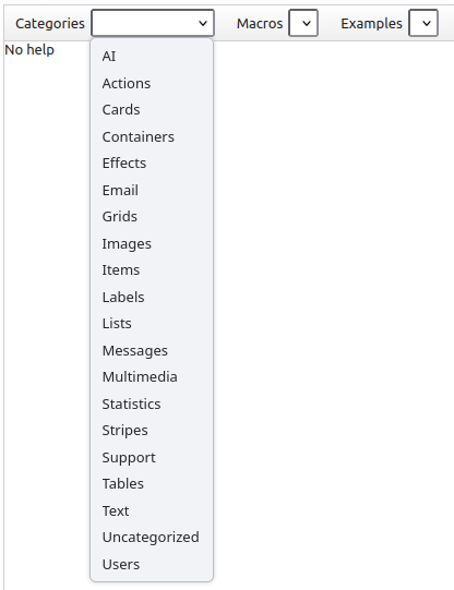
The editor has a large collection of categorized Wmacros. Select the category, the specific macro, and the example you want to see.

In the example panel, you'll see the wiki code, followed by the HTML/CSS/JavaScript output. Examples are not very populated, to ensure you can relate the code with the correspondent output.

Effect macros may require to refresh/execute command, mainly on effects involving appear/disappear transitions.


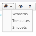
Open the Wmacros dialog using this option.
Conventional templates

This is a list of commonly used content templates. Does not reflect the actual number of templates available for layouts, entities and email senders.

Currently available templates
Banners

The banner templates use a JSON source as banner data. Its form is:

The most common way to use it would be the marker-jason macro {@marker-json:tmpl-root:template:repository-file}, where tmpl-root is files, template can be bannerImage or bannerCard, and repository-file would be the location of the JSON file.

In the example will be using the banners.json file, located at this context's repository.

With {@marker-json:files:bannerImage:*/banners.json} you get:

Some header
Sub header

Lorem Ipsum is simply dummy text of the printing and typesetting industry...

Some other header
Some header support

Lorem Ipsum is simply dummy text of the printing and typesetting industry...

With {@marker-json:files:bannerCard:*/banners.json} you get:

Some header
Sub header
Lorem Ipsum is simply dummy text of the printing and typesetting industry...
Some other header
Some header support
Lorem Ipsum is simply dummy text of the printing and typesetting industry...

JSON file

{
  "name" : "slider",
  "minHeight" : "400px",
  "banners" : [
    {
      "imageLink" : "banners/_internal/repository/elementals.jpg",
      "background" : "#00000066",
      "color" : "#fff",
      "header" : "Some header",
      "meta" : "Sub header",
      "description" : "Lorem Ipsum is simply dummy text of the printing and typesetting industry...",
      "action" : "Visit...",
      "link" : "#",
      "subaction" : "Or visit...",
      "sublink" : "#"
    },
    {
      "imageLink" : "banners/_internal/repository/emotion-ocean.jpg",
      "background" : "#ffffff66",
      "color" : "#000",
      "header" : "Some other header",
      "meta" : "Some header support",
      "description" : "Lorem Ipsum is simply dummy text of the printing and typesetting industry...",
      "action" : "Visit...",
      "link" : "#"
    }
  ]
} 
Testimonials

The testimonial templates use a JSON source as banner data. Its form is:

The most common way to use it would be the marker-jason macro {@marker-json:tmpl-root:template:repository-file}, where tmpl-root is files, template testimonial, and repository-file would be the location of the JSON file.

In the example will be using the testimonials.json file, located at this context's repository.

With {@marker-json:files:testimonial:*/testimonials.json} you get:

"Some testimonial"
John Doe
Any text
Any text
Any text
"Some other testimonial"
Jane Smith
Any text
Any text
Any text

With {@marker-json:files:vtestimonial:*/testimonials.json} you get:

"Some testimonial"
John Doe
Any text
Any text
Any text
"Some other testimonial"
Jane Smith
Any text
Any text
Any text

JSON file

{
  "name" : "slider",
  "minHeight" : "150px",
  "testimonials" : [
    {
      "imageLink" : "testimonials/_internal/repository/face1.png",
      "imageClass" : "small circular",
      "text" : "Some testimonial",
      "textClass" : "grey medium",
      "name" : "John Doe",
      "line1" : "Any text",
      "line2" : "Any text",
      "line3" : "Any text"
    },
    {
      "imageLink" : "testimonials/_internal/repository/face2.png",
      "imageClass" : "small circular",
      "text" : "Some other testimonial",
      "textClass" : "grey medium",
      "name" : "Jane Smith",
      "line1" : "Any text",
      "line2" : "Any text",
      "line3" : "Any text"
    }
  ]
}